
Mobile ABCs
MRI Software manages dozens of mobile apps across different products, regions, and acquisitions. Over time, this led to inconsistent app store presence, branding, and core mobile UI patterns.
We identified an opportunity to define a set of foundational mobile standards, or “ABCs”, that could immediately improve consistency across the ecosystem.
I led the design initiative to create a baseline mobile identity that all MRI apps could adopt.
A fragmented mobile ecosystem
As MRI’s mobile portfolio expanded, individual apps evolved independently across teams and products. Over time, this led to significant variation in how core mobile experiences were designed and structured.
Navigation patterns differed widely. Some apps relied on hamburger menus, while others used bottom navigation with different layouts and interaction patterns. Visual styles also varied, including inconsistent color palettes, iconography, and header treatments.
These inconsistencies extended beyond the in-app experience. App icons, naming conventions and preview screens were created independently, resulting in an uneven presence across the App Store.
For users moving between MRI apps, this meant encountering different interaction patterns and visual cues from one product to the next. For teams building new apps, there was no shared foundation to guide mobile design.
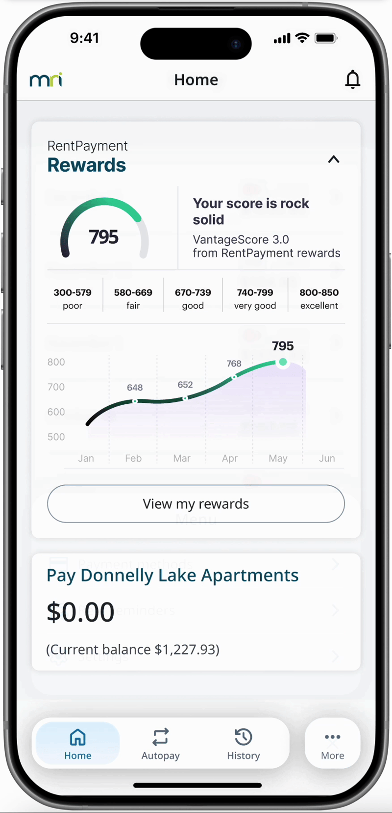
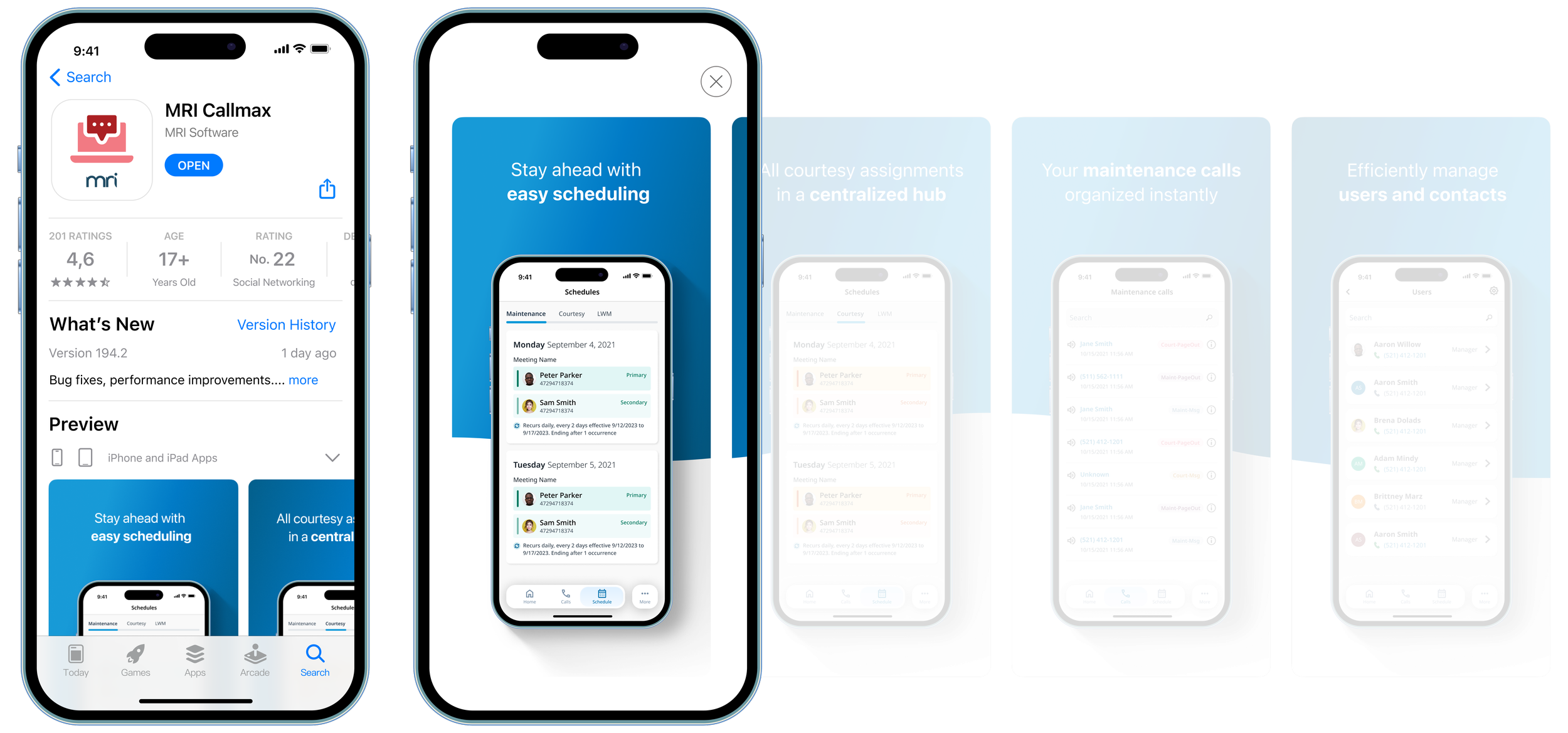
A shared mobile navigation
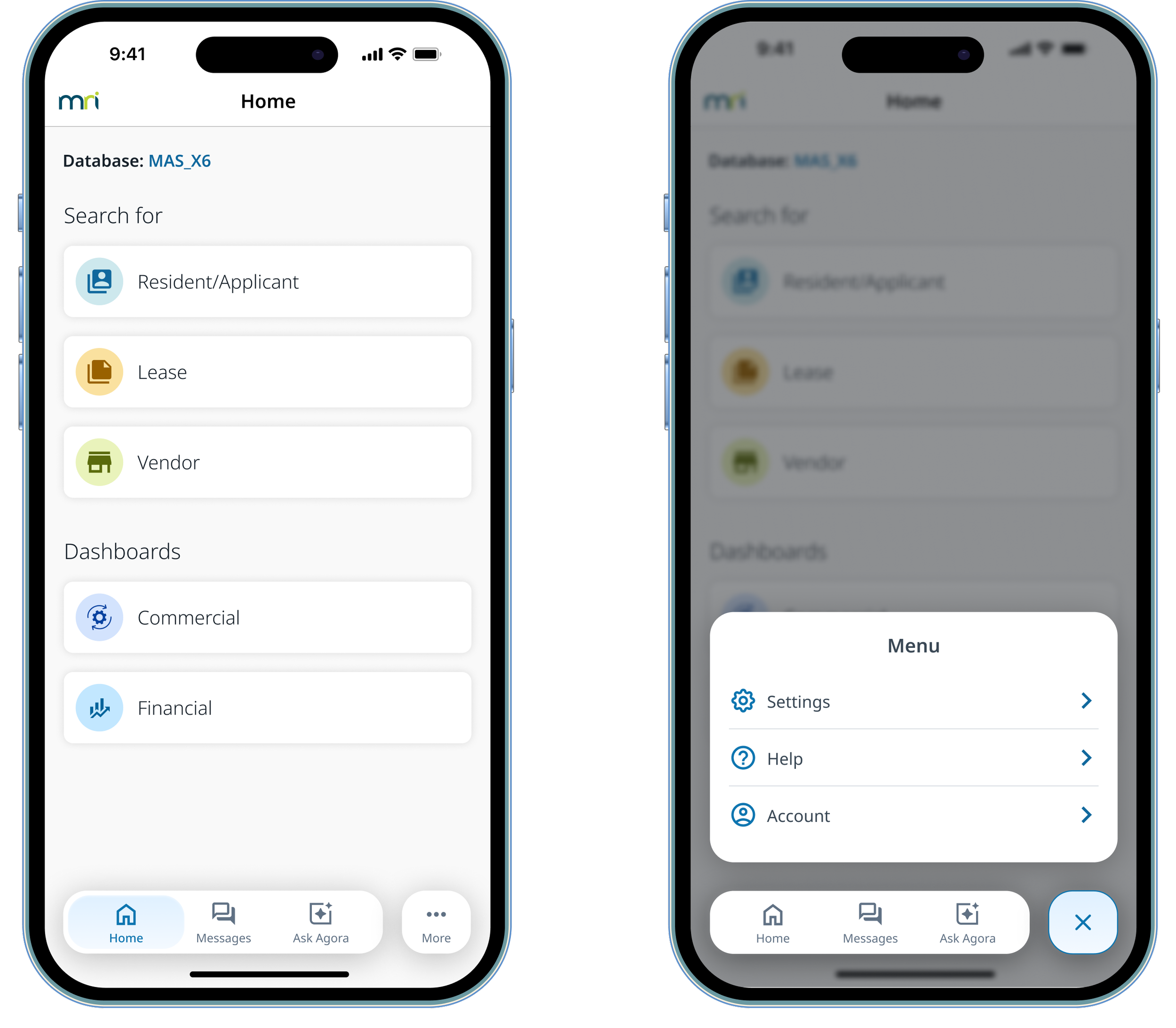
We introduced a shared navigation framework built around a floating bottom navigation bar to create a consistent interaction model across MRI mobile apps. The navigation includes three primary destinations with a dedicated “More” menu to accommodate additional sections when needed.
Apps previously relying on hamburger menus or other navigation patterns can migrate to this structure while still supporting larger information architectures through the overflow menu. The floating navigation and clear active states help users understand where they are within the app, while the standardized header and layout establish a consistent structure across different products. This approach keeps navigation predictable and scalable without compromising usability.
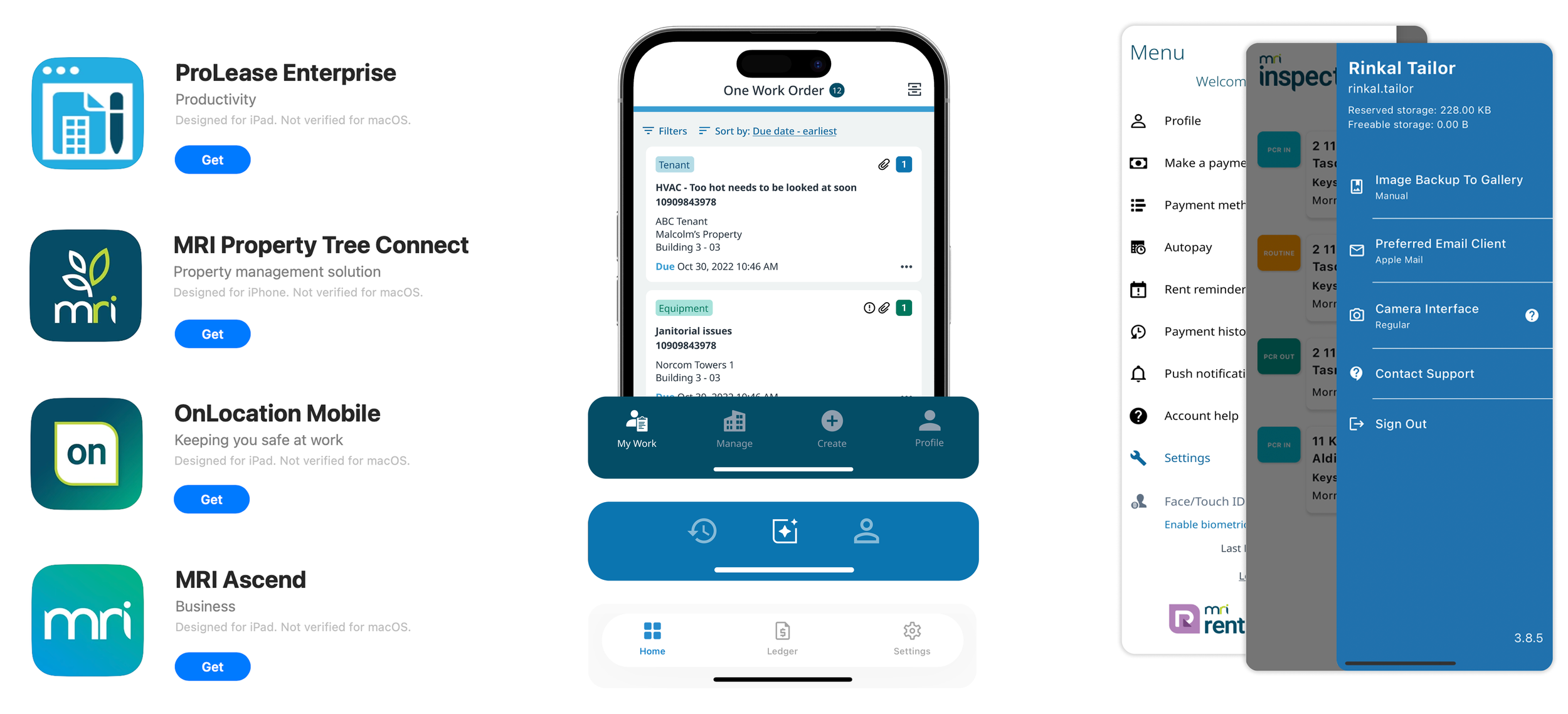
Establishing a mobile identity
From app icons and naming conventions to preview screenshots, we standardized how MRI apps appear across the App Store and user devices, creating a recognizable mobile presence across dozens of products, before a user even opens the app.
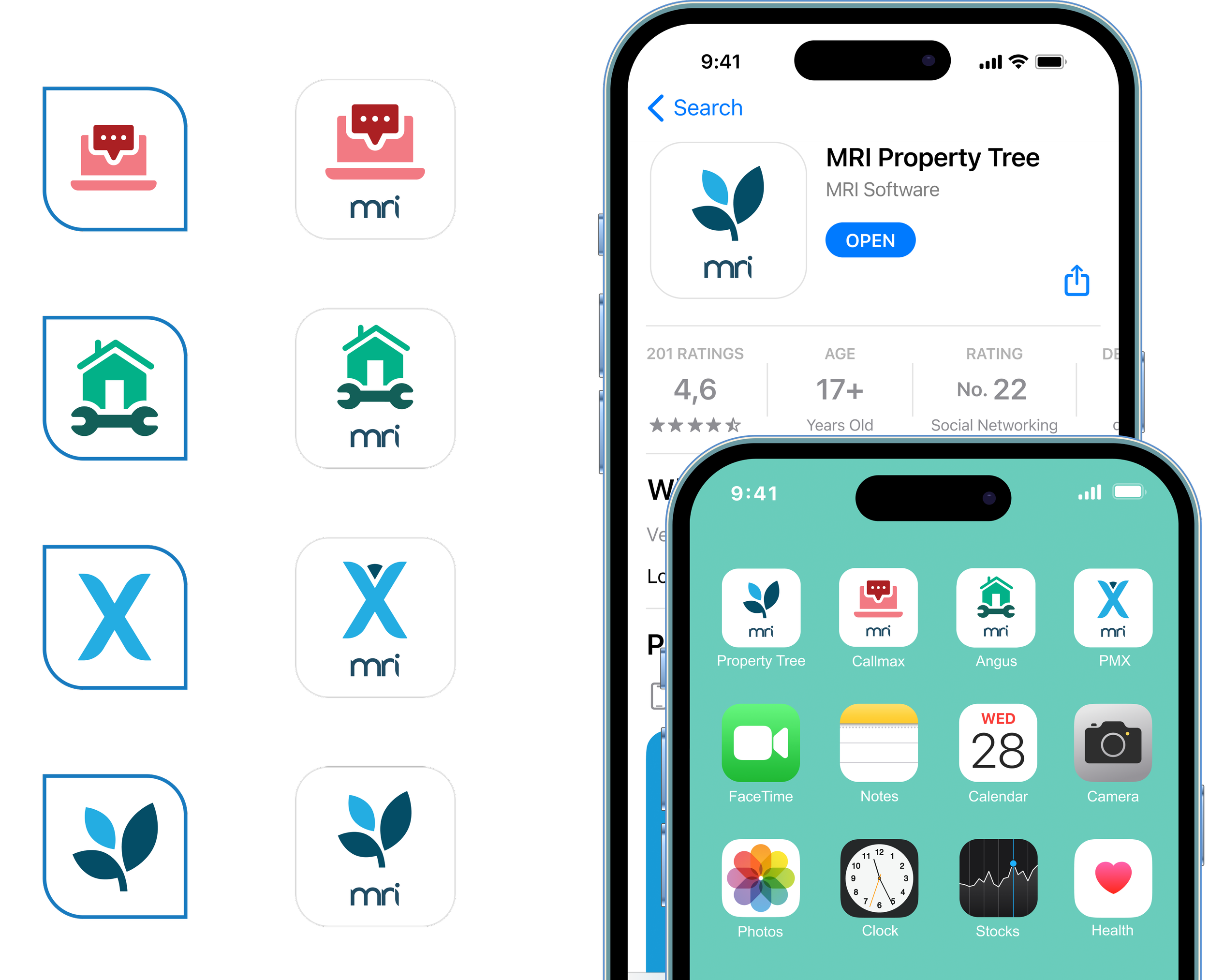
App preview experience
We introduced a consistent structure for App Store preview screens, combining a shared visual background, marketing descriptors, and key workflow screenshots. This ensures MRI apps communicate value clearly while maintaining a cohesive visual identity.
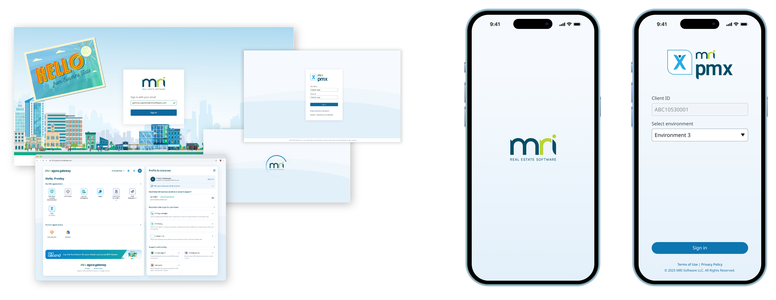
Aligning mobile with web
Mobile experiences were designed to align with the existing MRI web ecosystem. By maintaining consistency in visual language, sign-in flows, and branding, users moving between web and mobile encounter a familiar experience.
Designing for scale
MRI Software has a fairly large product ecosystem with dozens of accompanying mobile apps. The Mobile ABCs establish a lightweight set of standards that teams can adopt quickly while the broader design system continues to evolve.
Since defining these patterns, shared components have been developed and product teams have begun implementing the standards across their mobile apps. The initiative has been well received internally, helping address a long-standing challenge of fragmentation and creating a clear path toward more consistent mobile experiences across the platform.